Monday, March 25, 2019

Speed racer posters


Speed Racer Movie Review

Despite the negative buzz surrounding Speed Racer I love the Wachowski brother's film.This movie is honestly something incredibly special. Despite its bad reviews if you're a die hard speed racer film this was a special treat. 
The film is just a pop of color smashed with really impactful visuals. The only negative thing I can think of would be that if you're not already a speed racer fan it is very hard to get into. There are a lot of elements like chim chim that do not really click unless you know the lore. The casual viewer is left asking a lot of questions. 
Thematically speed racer has a lot interesting ideas. The concept of big business is a huge theme for the movie. Pop's shop is a small business and because of that it doesn't have a lot of power so they get screwed over. Family is also extremely important and learning from past mistakes. Pop's racer shows this a lot with how he deals with Speed leaving verses his first son Rex. Also respect for the past with how Speed wouldn't beat his brothers record.  

Wednesday, May 17, 2017

Senior Year; Semester 2

Senior Year Reflection

    Once again this has been a phenomenal year of eComm. I've learned so much that I am honestly just blown away. This year especially I learned how to work with real clients and successfully execute the uses of type on several different projects.
   
I think I've grown a lot thanks to this program. I remember when I first started high school and I would turn bright red anytime I had to do public speaking in front of anyone, even just my class. Over the years that stage fright has faded. I love going to public events for eComm and just talking to random people about my program. The senior show, 8th-grade high school fairs, Digigirlz events all of them I was able to go and talk about eComm to complete strangers and feel like I've made a contribution to this program.


Technology 

    This year the most important technological advancement would be the way I chose fonts and where I found them. I did a lot more focusing on finding unique trendy fonts that really brought out the message of a product. I started buying professional fonts in order to get a step up since I can't really draw my own typography yet. I think next year at KU I'm going to try to teach myself how to draw them because I've noticed through classmates work that it can really make a project shine if you make your own typography that is designed to specifically fit for that project.

Collaboration/ Communication

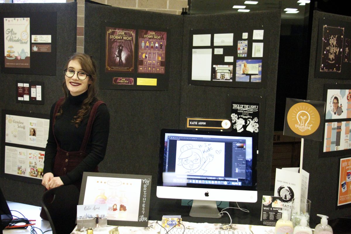
    One thing I have started to do is really collaborate and talk to multiple people in my class. I've been trying very hard to get over my shyness in this class in order to get better feedback from my classmates and then improve my work. By talking with more of the girls in my class I think I have gotten better feedback and had a lot more fun joking and working with them. I think I still need to work on my people skills but I've definitely gained more confidence by being a part of this program. I have a much stronger public speaking voice when I got to participate in eComm publicity events. I like getting out of my comfort zone when I'm passionate about something and I am ecstatic about this program. I will always come back to eComm as the reason I loved school. 
    Besides my leadership, my teacher's devotion to this class has been stellar. She's supported me throughout the program. She gives me countless hours of outside work that helps build my portfolio. Mrs. Burdolski has helped me with resumes for colleges and jobs; I was able to get into KU with her help and even get several interviews with graphic design jobs over the summer on the KU campus. I was able to even secure a well-paying job directly working with graphic design in the International department over this summer. I can't express how much she's helped me, no other program or teacher has gone nearly this far to ensure my success. I hope this program continues for a long long time because it's so helpful for seniors and juniors who are interested in a creative field.

Project Managment 

    How I learned this would be through a combination of Burdolski's class projects and outside work assigned to me. The one that really helped my typography would be my shampoo rebranding and the redesigning of a menu of a local restaurant. I think the logo work on my Fairytale shampoo was extremely successful because I listened to Burdolski and chose the more simplistic logo which had more focus on the typography rather than the graphics. It was a good choice because then that logo paired with my art highlighted each other and worked together well rather than trying to compete with each other for the viewer's attention.

    With the Menu project, I got a lot of practice with laying out fonts in InDesign. I had to make sure the balance was well focused on the titles and then smaller information was placed so that your eye would be drawn to that next. Overall I loved how the typography looked but if I could go back in I would fix how I placed the drop shadows so they wouldn't be cut off but the main focus of the project was achieved. I definitely want to explore projects like this more.

    I just want to express how thankful I am for this program. Year after year I've had expert advice and help. All of the eComm teachers are so sweet and inspirational; the courage they've given me to pursue a job in graphic design is irreplaceable. I've improved tremendously, outside professionals have told me my work is far past the expectations you would have for a Senior in high school. I have full confidence that this course has prepared me for college and beyond. I am excited about the future but I will miss this program above all else. Thank you so much for having this available and I hope in my future I can contribute back to this program so that the future generations can experience the same joys I have in high school.

Friday, December 16, 2016

Finals for Semester 1

1) I think i've accomplished a lot this semester. We have completed 3 different large projects in the class including the homecoming poster with infographic, a rebranding project, and are currently working on a menu design. Each of these projects took awhile but I think the most challenging was and fun was the rebranding one (took over 3 weeks). One thing I really enjoyed was watching my classmates take different roads when designing. Not one project looked the same. The creativity that was shown kind of blew me away because I haven't seen it so intensely till now. One of the most challenging parts of this assignment was to make the logo.  I started off this year wanting to make my typography skills escalate. I think I did accomplish this with the final chosen logo. 
I definitely stepped out of my comfort zone with this logo. It was a lot more type based which I tend to stay away from but it actually turned out really nicely. I originally wanted to go with a more image based one but thanks to Burdolski I think I made a better choice to show off my abilities and how they've grown from last year. Overall I loved how this project turned out. It was exactly, if not better, what I hoped for.
 

2) I think this year I've definitely learned how to manage my time better. The work load has been a lot heavier and the projects more challenging but because of it I've been able to learn the importance of meeting deadlines. With my first project of the year I definitely didn't have my stuff together.  I missed several deadlines and suffered. But from those sufferings I managed to learn how to get better at focusing and producing better work. I try my best to nitpick every tiny detail of my project until its perfect. Then I judge and push it a bit more. This has led to a lot of way better designed products! Also this Semester I've taken on a lot more outside work. I am trying to get endorsed by the end of the year and this has motivated me to work even harder and push myself farther. I've made brochures for friends parents. Business cards and seasonal holiday cards.  All of these things challenging me and getting me to the next level. 
 
I'd have to say my strength is still Illustration. It makes my work far more original and noticeable. I maximize these strengths by adding it into my projects as much as possible. I want to be able to show my portfolio to professionals and let them see my potential. I still need to work on my typography but by incorporating it more I think I've definitely stepped up my game this year. 

What I've loved most would be the openness of the projects. Especially the rebranding one. If I could go back I'd really like to redesign my poster for homecoming to make it more original. Overall I've learned that persistance is key and I'll figure out a solution if I just keep trying. I would like to keep working on typography.  

Friday, September 16, 2016

Homecoming 2016 reflection

For this project we had to make a visually attractive poster an infographic that portrays the theme “Dark and Stormy night at Raven Manor”. This was probably one of my more difficult projects due to the miscommunications and small amount of time we had on this project.
I started out sketching about 20 designs for the poster that had the theme dark and stormy. I Settled on 2 ideas of one with a banner that looked kind of like a pumpkin and a more witchy theme with a girl sitting on the moon above some spooky trees. I worked on the graphics and typography for the two for about a week and using mostly illustrator I vectored all my images to maintain a high quietly print. Then I got together with my classmates to review my work. We narrowed it down to my banner poster. I found the typography to be a very difficult challenge (since it's one of my more weak spots). We regrouped one last time and decided to get rid of my typography and pull in Jacklyn's. I used a lot of gold foil and vector art to try and portray the theme.
There are a lot of things I wish I could have changed but the major one would be to change my concept to my idea of drawing an old house on a hill with the moon large in the background. I feel like this idea would have fit the theme “Raven Manor” a lot better and I would have avoided the very similar idea Jacklyn and I shared. Another thing would to have used better typography by either talking to Brett or trying to draw it myself. It would have been a lot more difficult but the final product would have been much better than the online fonts. I did like my color choice (even if the committee did not, no idea why because it's what they asked for...) I think the purple to blue gradient looked wonderful with the dark outline of the people. The gold boarder turned out way better than I could have expected!

For my next project I am definitely going to focus on typography THEN graphics. I want to use more of my own artwork as well. Overall I think I learned how to better deal with an extremely difficult client, this will for sure be helpful in the future when I deal with this again. It was a fun project since I got to work with Annika and get her feedback. I wish I could do it again and try to make it better.


Wednesday, December 16, 2015

Graphic Design- Semester Reflection

This Semester in graphic design offered me personally a lot of new knowledge. I feel like I have learned a lot. We did many different projects like the Homecoming posters, Typography, and branding. I also did a lot of side work too.
Coming into this year I wasn't very confident with my Illustrator skills. Honestly I barely knew how to use the pen tool. We started off this year going over the basics and I think that helped me out a lot. Now I use illustrator constantly and it’s my best friend. Another trick I really appreciated learning was how to vector and image almost instantly. Image trace has saved me countless hours. I think I really improved my typography choices too. I can now match fonts and I know the rules to it. Learning about kerning and other elements helped me personalize it.
Some things I could work on next semester would probably be making my own fonts. I see a lot of kids in this class who are extremely talented with hand drawn fonts, I feel like this would make my works a lot more professional and stand out more if I used them. Another thing I could definitely improve for next semester would be communication with the class. I do talk and ask questions with the people next to me but I think it would be smart to maybe talk to Brett more often because I really admire his work and he comes up with a lot of cool and original ideas.
One of the highlights from this year was probably making the Homecoming poster and having it selected for the actual event. I was super psyched when that happened. I honestly didn’t think it would happen with all the other amazing posters that were made earlier in the year. I do wish I had more out of school projects to work on. I feel like making more challenging graphic would be a lot of fun and a good way to spend my time.  Finding out how to get some jobs like that would be something I need to figure out. This would also help my résumé for whatever Graphic design Programs I apply to for College.

Another big thing I decided on this year was that I wanted to do Graphic Design as a career. I’ve been researching it ever since the KU visit.  More visits like that would be extremely helpful. Currently I'm thinking about going out of state but Im not sure which college would be right for me. Although RISD did peak my interest. 
Hopefully next semester I can improve a lot and I can get an even more solid foundation in graphic design. I think it would be cool if we did more with Photoshop in this class, maybe do some sort of model photoshop tutorial. That really interested me last year.
Overall so far this year I feel like I have learned more than the past 2 years combined. This is a wonderful environment and I love having the class as my first two hours of every day. Can't wait to learn more!

Tuesday, October 27, 2015

Gestalt Principles in Graphic Design

Similarity

http://www.andyrutledge.com/gestalt-principles-2-similarity.php

   This article about the Similarity Property said that color, size, shape, texture, dimension, and orientation are not equal in their ability to communicate. Some parts of Similarity are used to mean different things. Similarity is also used to demonstrate organization and to have underlined means. Similarity is just a means of communication.
   In this particular article the author is trying to explain the uses of the Similarity Property. He goes into depth about the fundamentals and how color, size, shape, texture, dimension, and orientation effect the reader. At the bottom of the page he goes on and lists his sources of where he got his information. He uses a lot of web examples to prove his point. Some of his strengths were that he dwelled on the fundamentals which gives a novice like me a good idea of the basics. A weakness about the article would probably be the forces on web design which doesn't really effect me as a graphic designer.
  In this article the author does a fantastic job of supporting his main ideas with facts and images. I wish he could have talked more about graphics like Logos or Typography but the  Web information was interesting enough. The vocabulary wasn't to advanced or lacking, all of the information was easy to take in.

Continuation 


   With the idea of Continuation from Gestalt's principles we are taught about how the brain has a "tendency to preceive a line continuing" in a specific direction. Alex Bulat focuses on explaining how our brain picks up these various elements of design, even when there are no lines. He then goes on to explain how this effects graphic design. 
   He makes many claims about how little visual clues lead our brains to understand what is going on. He uses this picture as an example. He notes how our eyes follow where the mans hand is pointing. This, overall, is a very good article. The visuals he shows us are very clear and easy to understand. The only negative would be that I wish he had more information over how this can be uses with logos and other graphic design pieces. The general conclusion of Alex Bulat is that this principle is one of the most important out of the other 6 choices. 
   His arguments are supported but it would be nice if he cited where he got this information and included links. The evidence is very convincing. The vocabulary is also very very easy to read. It could actually be more complex. 
   

Closure 


  The Principle of Closure is literally about drawing conclusions. Closure is used to fill in information using easily recognized patterns. The author then goes on to talk about the different examples which range from history to graphic design. 
   His argument is that closure is not just a fancy graphic design idea. It also has to do with how you can make inferences and decisions while using closure. The main weakness from this article was that is was almost 50% about history and that information should have been replaced with more information about the graphic design point of view. 
   The argument was easy to understand, he used some advanced vocabulary but it wasn't hard enough for me, personally, to not understand. The evidence was convincing because he provided plenty of pictures and explanations. 


Proximity 


   With this Principle the author mostly explained that proximity is how we precieve parts of an object as a whole. He talks about how spacing and how you place objects explains how our minds group things. 
   He uses multiple examples with pictures and then explains them with text. His basic views on proximity is that we perceive structors based on their environment. One of the weaknesses about this would be that he didn't provide more examples and more in-depth explanations on why he choice the pictures that he did. 
   He supports his main claims perfectly. He cited all of his evidence and at the bottom of the page there were more links regarding this topic. The small pieces of evidence that he did use was thought out well. 

Figure/ Ground 


   This section focuses on the relationship between negative space and the elements within it. The author defines Design as the arrangement of "both shapes and space". The relationship is also complementary. The 2 can either take away or enhance each other depending on the layout. 
   
    There are 3 different types of relationships 
-Stable, It's clear what the main focus of the piece is and it dominates the composition. 
-Reversible, Figure and Ground attracts the attention equally. This creates tension 
-Ambiguous, Equally interesting shapes and based on the viewer either could be the main focus 
   
   Space is also very important, it establishes contrast, creates tension, provides grouping. Space can also be considered sophisticated or simplistic.

Symmetry and Order

This is the idea that we use abstract ideas and objects to portray an idea. You can use similar shapes to make you're audience see the pattern and design around that idea. Here is an example of Symmetry
With this example you can clearly see the invisible triangle because of the pattern and the order of the objects. You can also see the mini triangles outlined in black. 

Wednesday, September 23, 2015

Personal Project Review: Homecoming 2015

   This job was to make a poster design that captured the feel of the book "Night circus". The poster needed to be elegant and mysterious. My Process consisted of first sketching out about 20 well thought out sketches. I then went on to making my first version of the poster. There were still a lot of problems with this. First off the font didn't read well and it didn't really match with each other. Next I needed to ground the dancing girl.


What I learned from this project is that the first idea is never really the best version. I thought my poster looked great in this version but in the end I was able to really tie it all together. Also with this project I was able to get readjusted to using Illustrator. I was more familiar with Photoshop but with this project I feel like I really got comfortable with the software and the key shortcuts.
   If I had more time to fix up and change this project I would probably go back in and get rid of small errors like the white marks left by the flowers because if you look closely you can see them.

    Things I would do the same is follow the flowery elegant style using people. I feel like adding the girl in the center really brings out the beauty.
Some experiences I would draw into this project would probably coming up with more unique ideas that are all my own. Overall though I am very happy with the final project. It was selected out of the class to be the 2015 homecoming poster so that makes me happy. I hope I can do more good work like this again with my next project!


Here is my finished product for the Homecoming 2015 poster and tickets.


Friday, May 15, 2015

Final for Semester 2

Pre-Production 

So I was gone for most of the beginning work of this project. I was assigned to Trey, Mackenzie, and Libby's group. By the time I came back they had already decided the story. My main role I played in preproduction was working on the story board. We spent most of the first block day working on this along with planning out where we would go to film. 

Idea 

So the idea for this project was based off of a former video, Trapped. We made our current video as a squeal to that video. The plot was basically that there is a series of different experiments going on and our current main character is going through the most recent one. The most important point was the cube which was a symbol of the illusion. 

Editing 

The editing process was probably the hardest part for me. I didn't get all the clips or the voice overs so I had to compromise by changing up the sequence of the story. I made the scene with the scientists the opening. After he went through the scientists he went through a serious of tests and realized this was a test when he touched the cube and had a flash back. I think I could have done better with the editing if I had been there for the filming. Unfortunately my schedule conflicted with the changed filming date so I had to work with the shots that had been pre-filmed. 

Problems I faced 

I didn't have any problems with my group members. They were all very productive and helped in their own different ways. Technology wasn't an issue this time around either. The only thing I really struggled with would have to be getting my shots make sense since I didn't have all of them. Even with that problem I was able to make a decent video by changing up the sequence to make it flow better for me. 

What I learned

I think the most important thing I realized after this final project is the importance of being present for all meetings. If i had been there for the beginning I could have been more involved and helped more. Especially with filming, if i had been there I know we would have gotten many more close-ups and this would have broken up the shots much better. 


Overall I really enjoyed Video and I will miss it greatly when I can't take it next year. If I could take this class again I definitely would. I bet my class will go on and make some amazing stuff because overall I think the entire class is very talented. I will do my best to help support the ecoom program from the Graphic Design section. Good luck to all of the people who continue with different strands.